


Advertisement
How to Create a Stylish Twitter Cover Photo (Tutorial)
Your Twitter header photo can help you stand out. Learn to create a stylish Twitter cover photo without Photoshop using free GIMP and Inkscape.

Table of Contents
Advertisement
Advertisement
Do you want your Twitter profile page to stand apart? A good way to do that is to create the Twitter header photo in the style of a magazine cover. You can make your cover photo for Twitter without Photoshop by following this guide-cum-tutorial that uses the free GIMP and Inkspace instead. Know about everything from getting ready and taking the pictures to improvising them and using them in a Vogue magazine style header for your Twitter profile. ~ Ed.
So you have a business. Want to have a business, or just want to impress all your friends on social media?
In whichever case, for that reason, you want to look professional, sophisticated, and intelligent whenever someone sees your online persona.
You want people to see your online presence and think – did I see her on TV, or wasn’t he in that movie we saw last week.
You’ve seen some social media profiles that looked professional. “That’s not fair,” you think. “I can’t afford that.”
Then you think “I can do this myself”. But you start thinking of how great of a photographer you’re NOT. Maybe you could fix it with Photoshop, but then Photoshop isn’t free and who knows where you should start. You don’t have time to learn the whole software just for one thing.
It turns out you can get almost professional results like this for free. Anyone can learn how, and the best thing is, once you know, you can use it for just about anything (Facebook, Linkedin, etc.).

I’m going to show you how to create a Vogue Magazine inspired Twitter header photo like this one without having to purchase anything. All you’ll need is a computer and the desire to look amazing.
Advertisement
Get Amazing Twitter Header Photo For FREE
Wouldn’t it be absolutely awesome if your Twitter profile header looked like a Vogue magazine cover?
People would come to your profile and think “WOW she must have an army of people working for her”, or “she’s really got it together”. At which point they’ll make you queen of the universe. Well, maybe not queen but a great profile can still do a lot for you.
I spent a great deal of time trying to discover the secret to someone creating a profile like the one you see above. You need absolutely no knowledge of photography, Photoshop, or design.
I’ve included all the resources you’ll need to learn how to get that amazing Twitter header.
We’re going to talk about the topics as displayed in the table of contents above.
DO READ: How To Use Twitter To Build Your Blog Audience [Infographic]
Looking Like a Super Star
Let’s get a few things out of the way. I can almost see the look on your face when we start talking about taking a picture of you. May be you are thinking, “I love taking pictures”. Else, you are thinking “I HATE taking pictures”.
If you’re in the “I HATE” category, don’t worry, I get it. I don’t photograph well either. It’s like the mirror, and the camera have some kind of sick inside joke.
The mirror says “I’ll make him look normal when he looks at me” and then the camera says “and I’ll make him look like a fat doofus with bad posture when I take his picture”. And then the two of them laugh and laugh when I look at that awkward picture I hope no one will ever see.
Even though you don’t photograph well, I’ll bet (if you’re honest), there are a few pictures you’ve taken where you thought, “I kinda like this one”.
I’m going to give you some tips on how to best take a picture, but since I’m not a photographer, I’ll let you in on a secret I discovered. If you take enough pictures of yourself, one of them is bound to look good, even professional.
I can’t even tell you how many blurry, out of focus, or badly lit shots I took that were completely unusable.
Advertisement

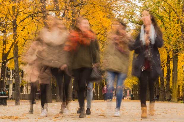
I also can’t even count how many very very very unflattering pictures I took of my friend here. I’d like her to speak to me again, so I have not included them here.
Just remember to take enough shots, and you’ll be surprised at the hidden gems you’ll find.
GOOD READ: 7 Untapped Social Media Tactics For Smart Bloggers
Before You Step in Front of the Camera
Before you step in front of the camera, it’s best to do as much as you can now to save time later. I’m going to show you how to erase blemishes, whiten teeth or even add makeup after you’ve taken the shot, but the less you need to do the better.
Remember, there is a limit to what we can do to a photograph after the shot is taken.
Let’s get ready for our close-up.
If you feel better with makeup on, make sure you have it the way you like it. Do the same for your hair. How good you feel directly affects how good you photograph.
With few exceptions, Vogue cover models don’t have much of any hair covering their face, so try to make sure your hair isn’t covering yours. Real magazine photo shoots sometimes have a fan that blows a models hair back, but this may not work for you, because your camera shutter speed may not be fast enough to make that work.
My friend in the blurry picture above has very little makeup on, and I am surely not knowledgeable about using it. Don’t feel like this is a big deal. You can do as little or as much as you feel comfortable with.
For all my fellas, I recommend you get a haircut. Part of looking like you have it together is looking like you have some hygiene. I can almost hear your eyes rolling through the screen. Don’t be sensitive, some of us can get a bit, shall we say, neglectful at times.
When it comes to shaving or not shaving, it really depends on what you’re trying to portray. A slightly rugged look may work well for you and the people you’re trying to appeal to. If your audience is all about mountain biking than slightly rugged is a good look.
When it comes to clothing, I would go with a color that provides some contrast for your skin. In my friend’s case, because her skin is on the darker side, I asked her to pick something that was bright.
We want your beautiful smile to jump off the screen. We don’t want it to get lost in a sea of similar colors. This is not as big a deal for pants or a skirt. We want the contrast mostly for your face.
Typical Vogue covers don’t have feet in the shot but just in case, find some shoes you like that go with what you’re wearing. That’s just in case you get creative with posing and end up with a shot you like that has your feet in it.
RELATED READ: 10 Proven Ways to Create a Social Media Plan for Bloggers
Related Posts


Glamourize the Picture
After you’ve taken the pictures going through the process of getting ready for the camera, taking care of lighting and the background, and posing in all the best ways, it’s time to clean and improvise the best picture from all that you got clicked.
Pick Your #1 Pic
Now that you’ve got all these pictures it’s time to pick the one that shows you as the superstar you are. Let’s start narrowing it down.
1. Discard all the blurry pictures. There’s nothing we can do with these to fix them.
2. Discard all the ones that you just plainly don’t like.
This should leave you with pictures that you like but the lighting might not be right for some reason, either too dark or there are glare regions.
If the picture is slightly too dark, we can fix that to a certain extent, however, if there are glare regions, we can’t really fix that.
If you think of each inch of a photograph as holding a certain amount of information or having a certain signal strength, then the regions, where the photo is dark, can be amplified like turning up the volume on the radio. But places in the photo that are white are like hearing a noise so loud that it drowns out everything else, even when you play it back at a lower volume.
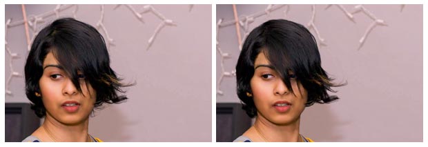
Take a look at this picture.
Do you see the regions on her shoulder and on her cheek that are more or less white? If we try to darken those regions, while leaving the rest, we won’t be able to achieve a usable look.
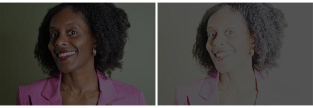
If we darken the whole thing, we’re left with the picture on the left. And, if we try to darken the light colored parts and keep or brighten the dark parts, we’re left with the picture on the right.
3. Now discard the pictures that have glare in them.
Here’s the hard part. You need to pick the one you like the best. This will be less daunting if you’ve discarded the 3 types of photos that we talked about above.
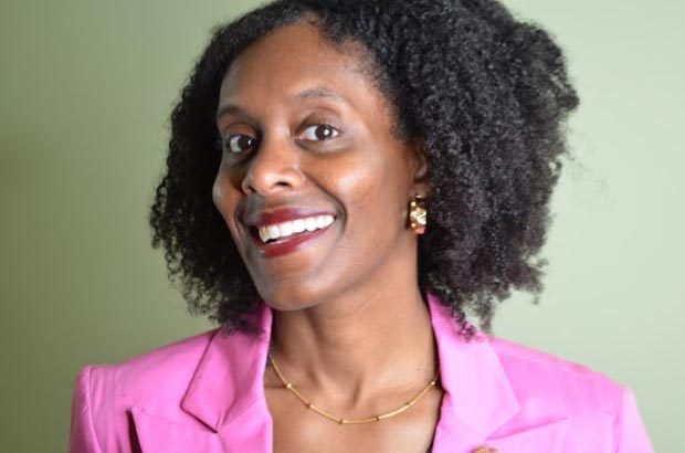
Start by narrowing it down to your top 5 then your top 3 until finally, you get to your favorite one. What helped me decide was that I was trying to create a Vogue-like cover with the least amount of work for later.
These three photos were my finalists. I think the blue sweater picture (let’s call it the blue pic) comes the closest to seeming like it should be on a Vogue cover. I’d be interested in hearing what you think in the comments below.

The blue pic also needs the least amount of work. I’ll need to do something with the lighting in the other two, and I’m not a fan of the wrinkles on her blazer that came through on the other two either.
Light and Dark
Now let’s fix the lighting problem if there is one. If when you look at your photo, you don’t feel like part of it is too light or too dark, you can skip this and move on to the next section. If you’re not sure, keep reading.
Fixing the light and dark regions, and the contrast, in general, can have a profound effect on your photo, and it’s with minimal work.
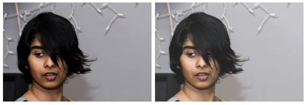
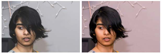
This is another friend of mine. Notice that you can see more in the picture on the right. The picture on the left is the original, and the picture on the right has had its contrast altered. It’s a little washed out (colors are not as vibrant), but we’re going to fix that.
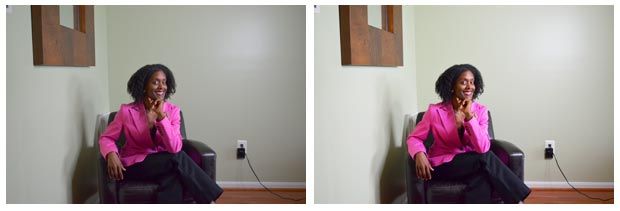
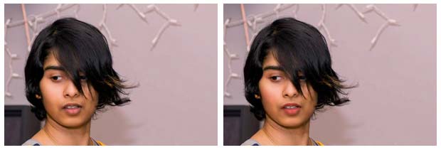
Here is another example. In this case, there is a noticeable difference when we fix the contrast (picture on the right).
Let’s talk about how to do that. I’m going to show you examples using software called Gimp. Gimp is a free open source image editing software like Photoshop.
Check out the tutorial “How to Use GIMP (Beginners Guide)” by TechGumbo on YouTube. You’ll only need to watch the first 6 min of it.
Gimp is easy and quick to use with lots of YouTube tutorials available. This is already going to be a pretty long article, so I’m not going to go into detail on how to use Gimp in specific. The tutorial will show you what you need to know.
If you’re using another program like Photoshop, then the general process is the same.
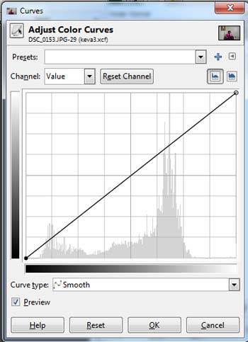
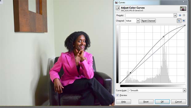
We’re going to fix the contrast by using color curves. In Gimp, you can find this in the Colors menu along the top of the screen. Select Curves, and you’ll see something like this.
The slanted line will look the same, but the graph underneath will look different because your picture will be different.
You can change the slanted line to make certain parts brighter and others darker.
Check out the YouTube tutorial called “GIMP Tutorial: Using Curves to Improve Contrast” by Jackson Bates. It’s an old one, but it teaches you what you need to know.
You can also make the colors of your picture more vibrant by increasing the saturation. In Gimp this is done by going to the Colors menu along the top menu bar and selecting Hue-saturation.
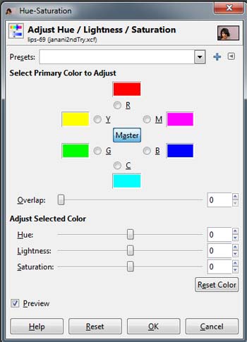
The bottom bar is saturation. You can bring back some of the color we lost when we fixed contrast by sliding this bar to the right.
Clear Skin
Now that you’ve got the contrast the way you like it. It’s time to get rid of any blemishes you don’t want in your final picture. This is not a step you have to do but you can if you like.
If you’re happy with the picture as it is, you can skip to the section on removing the background.
This part is more involved than fixing contrast, so be prepared to have some patience.
Whether you’re using a program like Gimp or Photoshop, there is a process called frequency separation that will allow you to remove blemishes or smooth the skin completely.
Take a look at the YouTube tutorial called “Gimp Tutorial 8 – Portrait editing – Skin” by mvaranda1000.
This one will show you how to get rid of any kind of skin blemish.
You can use the frequency separation method to smooth the skin. Take a look at these two pictures. The blemishes have been removed, and I used frequency separation to smooth the skin overall.
I also whitened the teeth. If you’d like to do that to your picture, then check out these tutorials.
“GIMP Tutorial – naturalistic skin and eye retouching” by Billy Kerr
“GIMP Tutorial – How to Whiten Teeth in Gimp” by Micky Sains
Lips and Eyes
This part is certainly optional. If you’re fine with the way your picture looks, you can move on to removing the background. I didn’t do too much more than skin smoothing, blemish removal, and eyebrow shaping for the picture I used for the Vogue-inspired Twitter header.
I did choose to experiment with applying lipstick, eyeliner, eye shadow, and blush just for the fun of it. This actually doesn’t take a whole lot of time. So, if you have some extra time, it might be useful to extend your skills.
This is what it looked like before (left picture) and after (right picture) the makeup. I added lipstick, eyeliner, blush and eye shadow.
I am far from knowledgeable about makeup, so I likely did not pick the perfect color for anything. If you, on the other hand, do know a little about makeup, the possibilities are endless.
I also attempted to work on her hairline, eyelashes, and change the eyebrows but that didn’t come out as well. I’m including that picture below for educational purposes.

This one was a bit too much. What I learned from working with these pictures is that you need to know when you’ve done enough. It’s better to do less than it is to do too much.
Now let’s talk about how you can try this for yourself.
Lipstick, blush, eye shadow, and eyeliner were all done the same way. I used the airbrush tool to put color over certain areas. I felt this was easier and more natural looking than some of the other ways.
If you want to know how to use the airbrush, then look at “How to use Airbrush in GIMP [Video Tutorial]” by HOWZA.
If you want to see how some other people have done eyes and lips check out “Gimp 2 makeup” by DiilXD and “Make up tutorial with gimp 2.8 part 1” by charmingfagi. Dii IXD’s technique could be used for lips as well as eyes, and had I seen that tutorial sooner I would have probably used that technique myself.
Hair
Unfortunately, you can’t do a lot with hair. What you can do, is get rid of stray hairs and darken regions that are too light. You can also use darkening to make hair seem thicker in some regions. Take a look at these two pictures, and you can see how you can get rid of hair that’s not behaving. To do this, I used the clone tool. If you watched some of the tutorials I mentioned earlier, this is the same approach.
If you’d like to learn how to use the clone tool, then take a look at “GIMP 2.8 Clone tool” By John Philip Jones” on YouTube.
Darkening or thickening hair can be done with the burn and dodge tool. Checkout “Gimp Cute Baby Tutorials 13: Dodge and Burn” by Drippy Cat on YouTube.
Removing the Background
Now you’re ready to remove the background. Luckily this is not a hard or complicated process. Take a look at “How to Remove Background with Complicated HAIR in Gimp | #6” by f&D.

It will show you how to get to this.
You’re going to want to export this as a png file. For that, go to the File menu and select “Export As”. Make sure it’s of type .png. Png files have what is called an alpha channel, which is what allows it to have a clear background.
We’ll need this clear background for our last part which is putting the picture in a Vogue magazine style that will work as your twitter header.
MUST READ: 14 Top Tips to Get Pinterest to Rock Your Blog Traffic
Magazine Cover
Now that we have our picture for the twitter header we need to put everything together. You could no doubt do this in PowerPoint, Google Slides, or Google draw.
We’re going to use a program called Inkscape because it is very well suited for what we’re trying to do. Inkscape is a free vector graphics program. The short of it is that vector graphics are pictures that don’t get blurry or change even when you zoom in super close.
Many of the icons and illustrations you see on the web these days are vector graphics because they must be viewable on many different devices, large and small.
It’s free, open source, and fairly easy to use. It works on pretty much all operating systems so you should be covered no matter what kind of computer you have.
To get started with Inkscape check out “Inkscape Basics (a free tool)” by DIY Graphic Design on YouTube. It’s only about 7 min long, and it’ll give you what you need to know to do what we need to do.
Dimensions
Twitter recommends that your header is 500×1500 pixels. Unfortunately, the interface pretty much insists, on cropping part of your image even when you use those dimensions. Using Inkscape, I left about 60 pixels of height at the top and bottom of my image.

I accomplished this by making a box like this.
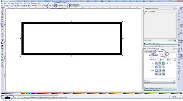
In Inkscape, you can create a box by using the box tool on the left menu bar. From there you can make it the dimensions you want by going to the top menu bar and entering the height and width.
Now you can change the width of the lines by going to the bottom left corner and clicking on the box that reads stroke. This will bring up the Stroke selection box on the right where you can select the stroke thickness.
My box dimensions are as follows:
H:500 px
W: 1500 px
Stroke Style Width: 33.3
Next, I made another box that’s grey and will serve as the background for our Vogue style magazine cover. You can create it the same way you did the black bordered box but this time turn off the stroke.
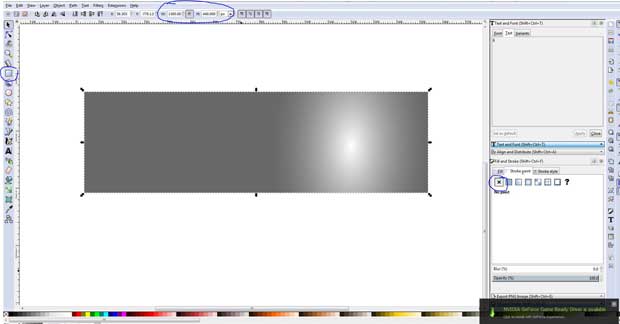
Here are the dimensions I used.
H: 440
W: 1500
Color: 6a6969ff
I also created a gradient to go around the picture photo we made. That’s an optional step, but it does draw the eye to your photo. Check out this quick 2 min tutorial “Inkscape Basics: Working with gradients” by Tutorial Horizon on YouTube to find out how.
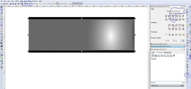
Now you can align the two boxes together. You can use the alignment tools to make sure they are aligned, and you can use the order tool to make sure the gray box is on top.
It’s time to add that photo we made. You can go to the File menu and import it from wherever you saved it. Make sure the photo is on top. You can use the order tool circled above at the top of the menu bar, or you can select the picture and hit the home button on your keyboard.
Now add the text you’d like to have. Watch this text tutorial “How To Edit Text In Inkscape” by Waylight Creations on YouTube for a quick lesson on text.
The font I used for the Main Title is Bodoni MT. It’s the closest thing I found to what they have on the Vogue cover. For the rest of the text, I used Century Gothic. Experiment with different sizes as well as using bolds and italics to make things stand out.
I got the title to appear to be both in front and behind the picture by putting the full title behind the photo and then putting the single letters R and E as separate text elements in front of the photo.
I purposefully picked a color that matched her sweater, but that’s optional.
Once you have the text you want, you’re ready to export it.
Conclusion
If you made it this far, then I congratulate you. It’s been a long trip, but hopefully, now you have the information to create a professional looking Twitter header profile picture. That’s not to say that you can’t use this same approach for Facebook and other social media platforms.
Now go out there and impress everyone with that beautiful Twitter profile and profusely promote twitter account.
Over to you –
Do let me know what you think of this tutorial in the comments. Include any questions or suggestions about creating a Twitter header cover photo.
Advertisement
Disclaimer: Though the views expressed are of the author’s own, this article has been checked for its authenticity of information and resource links provided for a better and deeper understanding of the subject matter. However, you're suggested to make your diligent research and consult subject experts to decide what is best for you. If you spot any factual errors, spelling, or grammatical mistakes in the article, please report at [email protected]. Thanks.
Advertisement


Hi,
This is an age of social media and everyone loves social media. Now your post solves many problems of many peoples. Thanks for sharing the help.
Oh wow! This is super amazing.
I used to post my cover photos but photos were not attractive and people also didn’t like it.
But after reading your article. Now, I’m going to create awesome and attractive photos.
thnx!
Keep up the good work!
Thanks for Sharing excellent Information about “Twitter Cover Photo (Tutorial)”, I love your article. I will definitely share your article on my social networks. Again thank you!
Keep sharing this type of article!
Thanks for this article. Cover photo is really important. As a professional Graphic Designer I can say design should be kept as simple as possible and image should be good quality.
Thanks again for this tutorial.
I made my twitter header pic by your suggested ideas, but it does not look as goods as yours. I am missing something. may be the color combination is not working for me. How to match background color with pic color. Any idea on this?
Wow, this is super cool, William. It looks like a lot of work. But, the results are awesome. I used GIMP in the past and now I use Canva. My photo definitely needs work. I took it myself with my phone. 😉
It would be interesting to see the stats before and after you replace your photo. OR, even A/B test different photos. hmmmm.
Awesome post and thanks for these glorious tips.
Hi William. Thanks for the tutorial. I use GIMP all the time for simple things but I didn’t know about Inkscape. I also appreciate how to referred to existing tutorials on YouTube. Like you said, there are so many tutorials out there, which is good, but can make it hard to find the one that that will help you the most.
BTW, I think you chose the right photo. She comes across as the most confident in that one.
Hi, William, this is a very informative post for someone who is really considering to jazz up twitter header photo. I normally use online pixlr dot com which covers up my needs.
I would say that a neat and clean header pic is the minimum requirement. Interesting and attractive header pic normally gains attention. Thanks for informative post.
Hi William,
It’s nice to e-meet you! Have a nice, professional header photo is important. I’ve head the same photo for a while now and ready for a change.
Thank you for this awesome tutorial! I’m going to play around with GIMP and see what I can come up with.
No doubt I’m passing this along. 🙂
Have a great day and rest of the week!
Cori
Hi William,
This came just in time for me. I am so bored with my Twitter header. Its OK, but I wanted to change it so it can stand out and people can see what I do.
All your tips helped so much! I do have a professional shot but it is getting old for me. I want something different so I’m off to play around with this.
-Donna
Hi Donna,
I’m so happy to hear that. I can’t wait to see what you come up with.
HI William, have a great profile pic on Twitter is so important. I don’t like to follow people if they don’t. I want to know who are they? Right?
I use Photoshop to do mine and the cover image. I just reworked mine recently.
I am going to have another profile pic shot this year – I usually have it done professionally as I use it for my gravatar image as well. The only place I go casual is Facebook.
Thanks for this awesome tips, love the one on the hair and lipstick. Excellent points!
Hi Harleena,
It is indeed a great joy to be here after a gap.
Glad to read William’s post. Oh, this is indeed an informative tuto.
The step by step tips are easy to follow, I am sure this stylish cover photo will give more attention to the visitors.
Thanks William for explaining it here for the readers of AhaNOW.
Keep sharing.
May both of you have a great time of sharing ahead.
Best
~Phil
Thanks Phil! I really enjoyed writing it. I hope that readers find it useful.
Hey William,
I have used GIMP for removing the background and a few other kinds of stuff but never really focused on the hair color and other things you have mentioned above.
It’s always good to know the new things to craft a professional Twitter header. I have around 19K+ followers and it’s important to build a brand.
Thanks for this tutorial.
~Ravi
It was my pleasure, Ravi. It’s amazing what you can do with the free programs out there. Especially when you couple them together.
Thank you Harrison for this wonderful post. I have always been asking myself my my images not fit on my social profile like facebook, but I now have the answer.
Thanks again for the dimensions
Alex
No problem Alex. I hope you can impress all your followers now.